Case study · Fitness · Mobile
Four fitness apps. One gym bag.
Most lifters juggle a tracker, a diet app, a calculator site, and a group chat. The Gym folds all four into one companion, with a body map that knows which muscles you have earned the right to train today.
01 · Context & problem
Fitness data everywhere, insight nowhere.
The data a lifter needs exists, scattered across four apps that do not talk to each other. The question nobody's app answered: what should I train today?
- Trackers log the past but say nothing about recovery or what comes next.
- Diet apps count calories in isolation from the training that spends them.
- Community lives elsewhere. The gym's trainers, people, and knowledge never reach the workout screen.
02 · My role & constraints
Concept work, treated like a shipped product.
I owned the whole concept: the four-job product strategy, the information architecture, every flow, and the full UI system across roughly forty screens.
- The competition is a habit, not an app. Lifters already have a routine of four tools. Switching costs had to be beaten by one screen that earns the first open of the day.
- Gym conditions are hostile. Sweat, shaking hands, ninety-second windows between sets. Every screen was designed for that state, not a couch.
- Data density without spreadsheet feel. A serious lifter tracks a lot. The UI had to hold it while staying friendlier than a log book.
03 · The organizing idea
Your body is the interface.
Instead of lists and charts first, The Gym opens on an anatomy map: every muscle carries its recovery state: “Chest · tired · involved 4 days ago.” Training decisions become a glance, not a spreadsheet.
The daily loop
- Check the map what is recovered?
- Plan exercises + meals
- Train & log sets, weights, kcals
- Recover the map updates
04 · Structure
Five tabs, four jobs.
The information architecture maps one tab to one job, so the bottom bar reads like a training day: check, plan, do, belong.
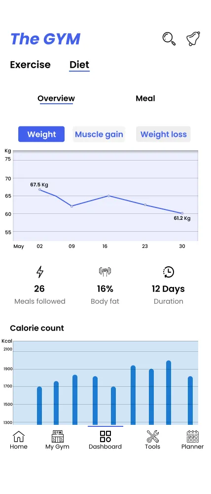
- Home + Dashboard covers stats, the body map, and progress charts. The tracking job.
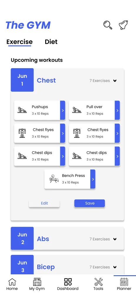
- Planner handles exercise and meal planning with library pickers. The planning job.
- Tools packs six calculators and reminders. The utility job.
- My Gym holds posts, articles, trainers, and gym profiles. The belonging job.
05 · Key decisions & tradeoffs
The body map won the home screen.
Every fitness app opens on charts. This one opens on you. That call, and two others, defined the concept.
- Anatomy first, numbers second. A stats dashboard was the safe default and it lost. The body map answers the only question that matters at the door of a gym: what should I train today? The tradeoff is that charts moved one tap deeper, which data lovers will feel.
- Recovery states use plain words. "Tired" and "involved 4 days ago" instead of readiness percentages. A fake-precise number would promise sports science the concept cannot back; honest language builds more trust than borrowed decimals.
- Meals and exercises share one planner timeline. Separate tabs were cleaner to design, but training and fuel are one decision in real life. Merging them cost layout complexity and bought the app its reason to exist.
06 · What it proves
A signature interaction can carry a whole product.
- I can find the one screen that justifies an app and build the architecture around it instead of around features.
- I can design for physical context: every size, contrast, and tap target in this UI assumes a pounding pulse.
- I know when to say no in my own concepts. The reflection below is part of the work, not an apology for it.
07 · What I would do differently
Cut the sixth calculator.
Completeness was the concept's ambition and its risk. Four jobs is a lot of app. Today I would ship the body map and planner first, earn the daily habit, and let the community layer arrive once there are people to greet.
01 · The essence
Athletic clean, legible with shaking hands.
This UI is built for the ninety seconds between sets: big rounded cards, one periwinkle jolt of energy, numbers you can read through sweat. It moves like a good training partner: upbeat, organized, and never in the way of the next rep.
02 · Foundations
One accent, four macros.
The palette
Values sampled from the shipped screens. Functional color only: the accent acts, the macros inform.
#5B6CF2 actions · active #23262F #FAFBFF #FFFFFF #E4574D macro chip #EFB93F macro chip #5B6CF2 macro chip #34B36F macro chip The type scale
A friendly rounded sans, sized to be read one-handed between sets. Stats get the weight, prose stays light.
The spacing rhythm
4 8 16 24 32 The corners
Cards · 16 Buttons · 12 Chips · 999 The product's own components
03 · Key screens
The map, the fuel, the plan.
The body map: recovery at a glance
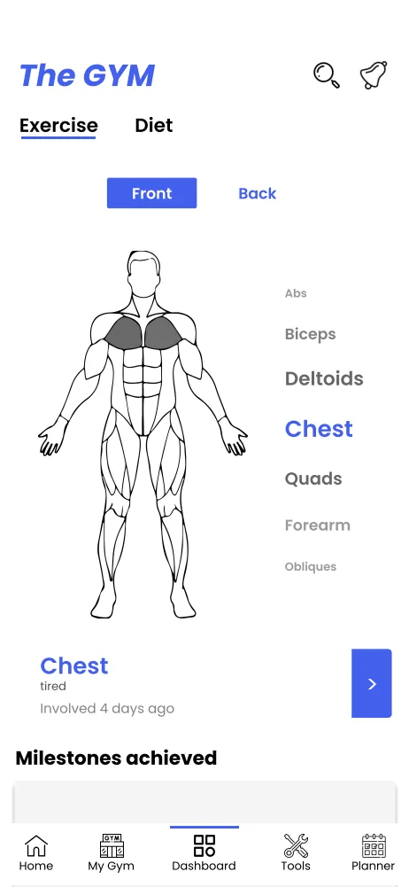
The signature screen: recovery states rendered on the body itself. Tired muscles tell you to wait, fresh ones volunteer.
Home: the day in one card stack
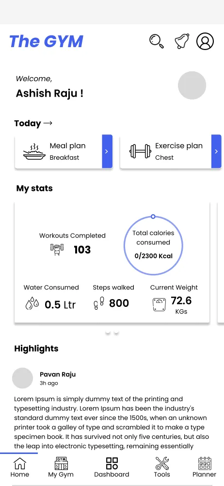
Everything the next hour needs, above the fold.
Diet & planner: fuel meets schedule
04 · Motion & micro-interactions
Feedback with a heartbeat.
- Muscle regions fade from tired to fresh over recovery days, so the body map quietly changes between visits like a body does.
- Stats count up on open, a half-second of momentum that makes yesterday's work feel banked.
- Macro chips fill as meals are logged, turning the day's nutrition into a progress bar you snack against.
- The planner day expands with a spring, exercises and meals unfolding in one motion instead of a page change.
05 · Honest scope
A concept, shown as designed.
The Gym is concept work. The numbers on screen are sample data, and I claim no outcomes. What it demonstrates: information architecture for a true multi-job product, and a signature interaction (the body map) that gives the whole app a reason to exist.