Case study · Marketplace · Mobile concept
Every pet service, one friendly app.
Finding a dog walker in Hyderabad means a dozen phone calls and an act of faith. PetVerse is a marketplace concept that puts care, grooming, training, and socializing on one screen, priced, rated, and within walking distance.
01 · Context & problem
Pet care runs on word of mouth.
Services exist, walkers and groomers and trainers, but discovery is phone numbers passed between neighbors, with no prices, no ratings, and no schedule.
- Discovery is social luck. The best groomer in the colony is a rumor, not a listing.
- Comparison is impossible. Price per walk, distance, experience. None of it side by side.
- The pet has no profile. Every new provider starts from zero about your animal.
02 · My role & constraints
A marketplace and a brand, from zero.
I owned the concept end to end: the brand voice, the four-category information architecture, the discovery flow, and the full UI system.
- Trust is the product. A stranger walks your dog. Every design decision had to move a pet parent from suspicion to comfort.
- Both sides matter. Providers are small operators, often one person. Their cards had to make them look professional without dressing them up as companies.
- Local reality first. Rupee pricing, kilometre distances, colony-level trust networks. A translated Western template would have failed here.
03 · Core flow
Category → filter → a provider you can judge.
Four service categories, Care, Grooming, Training, and Socializing, each opening into filterable provider cards that answer the three questions that matter.
Finding a provider
- Service tab four categories
- Category tile expands
- Filter sub-type chips
- Compare price · distance · rating
Every provider card leads with price per unit ("Rs.180/Walk"), distance, and rating. The pet parent's mental checklist, made literal. Pet profiles and activity scheduling carry your animal's context to whichever provider you choose.
04 · Key decisions & tradeoffs
Comparison beats browsing.
Marketplaces die when choosing feels like gambling. Three calls tilted PetVerse toward confident decisions.
- Price, distance, and rating live on the card face. Tucking them into detail pages would make listings prettier and decisions slower. Front-loading the three comparison facts means a pet parent can shortlist without a single extra tap.
- Four doors instead of a search bar. Search assumes you know what you want. Care, Grooming, Training, and Socializing as tappable doors teach the catalog while you browse it. The tradeoff: power users take one extra tap, and filter chips give most of it back.
- The pet has the profile, not just the owner. Breed, age, temperament, and vaccination travel with every booking, so no provider starts from zero. It cost an onboarding step; it saves the same conversation forever.
05 · Designing for trust
Softness is the strategy, not the styling.
Handing over a pet is an act of faith. The interface works on that anxiety long before any booking button appears.
- Experience is stated in years, right on the card, because tenure is the trust signal pet parents actually ask about.
- Distance is a comfort metric. "3.1 KM" reads as "close enough to check on", which matters more than convenience.
- The warm visual world does quiet work: paw doodles and pastels tell you this product likes animals before a single word does.
06 · What it proves
Personality and mechanics, in one concept.
- I can give a marketplace a voice without softening the comparison mechanics that make it useful.
- I design for emotional stakes, not just task completion. Trust has an interface, and it is mostly small honest details.
- I can build a brand system from nothing: the logotype, palette, and tone all came from one idea, a park instead of a warehouse.
07 · What I would do differently
Design the booking, not just the browsing.
The concept nails discovery and comparison but stops at the provider card. The booking and payment flow is the half where trust is truly won or lost. That is the next screen I would design, before any visual polish.
01 · The essence
A park, not a warehouse.
Most marketplaces look like inventory systems. This one looks like the place you'd rather be: mint-sage air, paw-print doodles, pastel doors to each service, and an orange logotype that wags. The warmth is structural, in the round corners and soft shadows, not sprinkled on top.
02 · Foundations
Pastels with jobs.
The palette
Values sampled from the shipped screens. Four pastels code the four service categories; orange belongs to the brand.
#CFE9E1 #F2842B logotype · CTAs #F3D98B Care #A8DFE8 Grooming #F6C6A8 Training #D9CFF2 Socializing #333B39 #FFFFFF The type scale
Soft shapes, honest numbers. Playful in headings, matter-of-fact where money and distance are involved.
The spacing rhythm
4 8 12 16 24 The corners
Tiles · 20 Cards · 16 Pills · 999 The product's own components
03 · Key screens
From welcome to walkies.
Welcome: paw-sibilities await
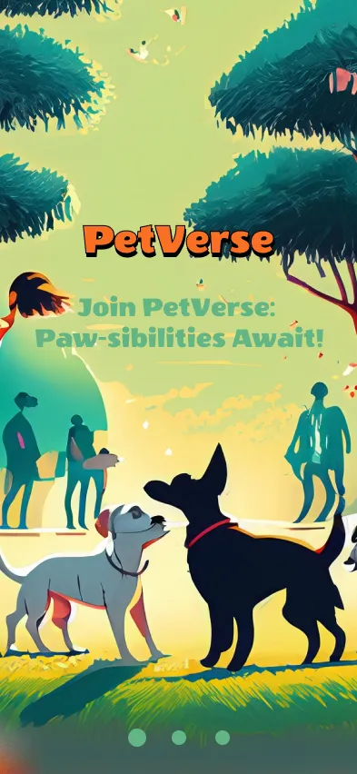
The brand promise in one screen: friendly, local, and a little bit silly, like pet people.
Home: the four doors
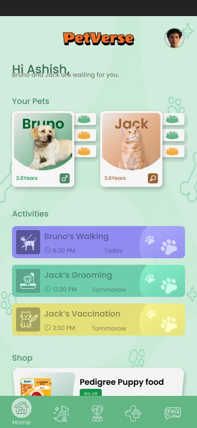
The active category tile grows on selection, a small moment of life that makes the grid feel petted.
Listings: comparison made visible
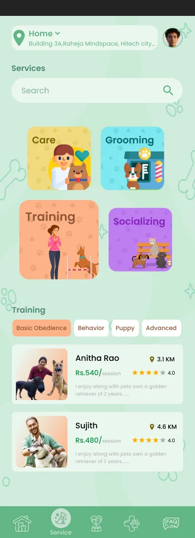
Provider cards front-load the decision criteria, so choosing feels like comparing, not gambling.
04 · Motion & micro-interactions
Movement with a wag in it.
- The active category tile grows when selected, a small living response that makes the grid feel petted.
- Provider cards lift softly on press, a gentle acknowledgment rather than a mechanical click.
- Filter chips fill with orange as they activate, so the current narrowing is always visible at a glance.
- The Book button presses with a bounce, the one moment of pure play reserved for the decision that matters.
05 · Honest scope
A concept with a clear voice.
PetVerse is exploratory concept work, so there are no shipped outcomes and no invented numbers. What it shows: I can give a marketplace a personality without sacrificing the comparison mechanics that make marketplaces useful.