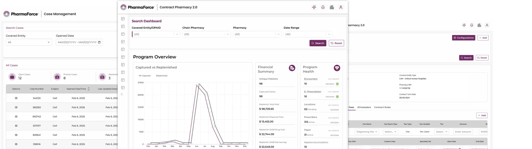
Flagship case study · Healthcare SaaS · 340B
Seven tools. One obvious product.
PharmaForce is a B2B healthcare SaaS platform for the 340B Drug Pricing Program. Powerful backend, fragmented experience. I led the redesign of the whole ecosystem.
01 · Context & business problem
Support had become the UX layer.
Claims, compliance audits, reconciliation, contract pharmacy workflows, each in its own tool, with its own rules. Users paid the tax.
- Inconsistent everything. Buttons, tables, and layouts changed between modules, so users re-learned the product seven times.
- Cognitive overload. Dense multi-tab forms demanded memorization in compliance-critical tasks.
- No guidance, no feedback. No onboarding, no contextual help, no real-time confirmations.
- Humans as the patch. Account managers walked users through basic tasks. Support was compensating for design.
02 · My role & constraints
Senior UX Designer, ecosystem-wide.
I owned UX strategy and the design system across the suite.
- Compliance could not bend. Every redesigned flow had to keep full auditability.
- Analysts wanted density. “Simplified” views tested worse. Trust lives in the detail.
- Teams shipped in parallel. Multiple product teams needed one source of truth, immediately.
03 · Research & process
Empathy first, then a foundation that scales.
User research came first: interviews with pharmacists, analysts, and account managers, and journeys mapped across all seven tools with the cross-functional teams who ship them. Two principles governed every screen: “What am I doing?” and “What’s next?” must always have answers.
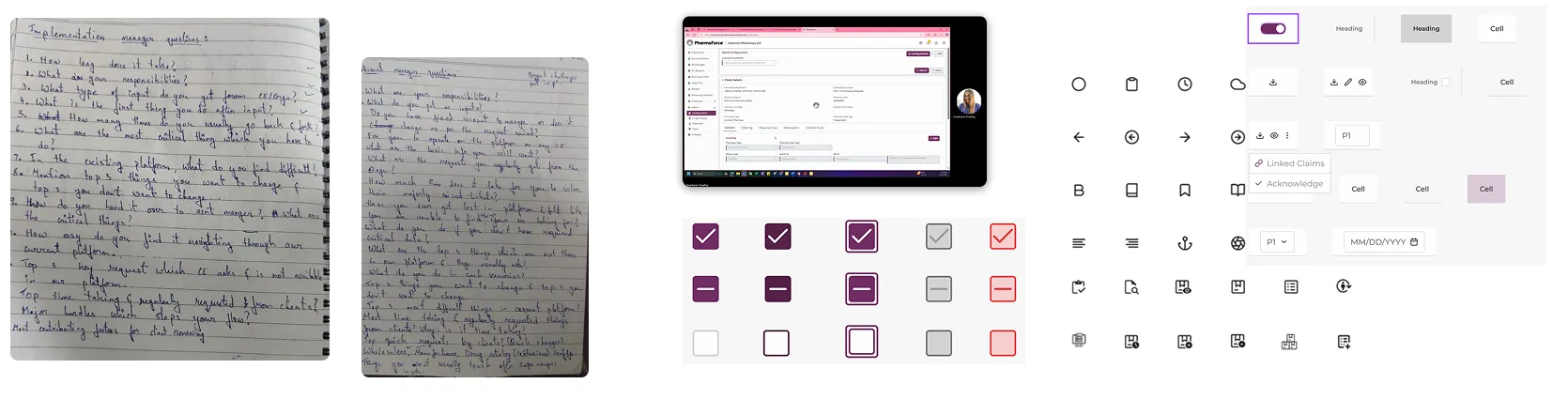
04 · Testing & iteration
Tested, walked through, audited, then iterated.
Two rounds of usability testing, a heuristic evaluation, stakeholder walkthroughs, and a full accessibility audit kept the redesign honest.
05 · Results
The outcomes, as measured.
One library, seven products. Every number below is from the study.
06 · What I would do differently
Start the feedback loop on day one.
The in-app feedback widget and weekly UX-support syncs arrived after launch, and immediately paid for themselves (navigation tickets fell 60% in two months once support themes were mined weekly). Next time, that loop ships with the first release, not after it.
01 · The essence
Clinical calm, an interface that lowers the pulse.
340B work is compliance work, so this UI dresses like the professional in the room: near-white silence, one deep plum authority color, and data density arranged until it reads as competence. Where a consumer app would decorate, this one breathes.
02 · Foundations
Tokens before taste.
The palette
Primary, accent, and surface are the system's exact tokens from the design-system spec; status values are from the shipped badge set.
#702C62 actions · selection #BBE0E6 highlights #FEFEFE app ground #2B2B2B text #2E9E5B #E9B949 #D64545 #6E6E72 meta text The type scale
Montserrat across the suite. One geometric sans, with weight (not color) carrying the hierarchy.
The spacing rhythm
4 8 16 24 32 48 The corners
Inputs · 6 Cards · 10 Pills · 999 The product's own components
03 · The system
Fifty components, every state named.
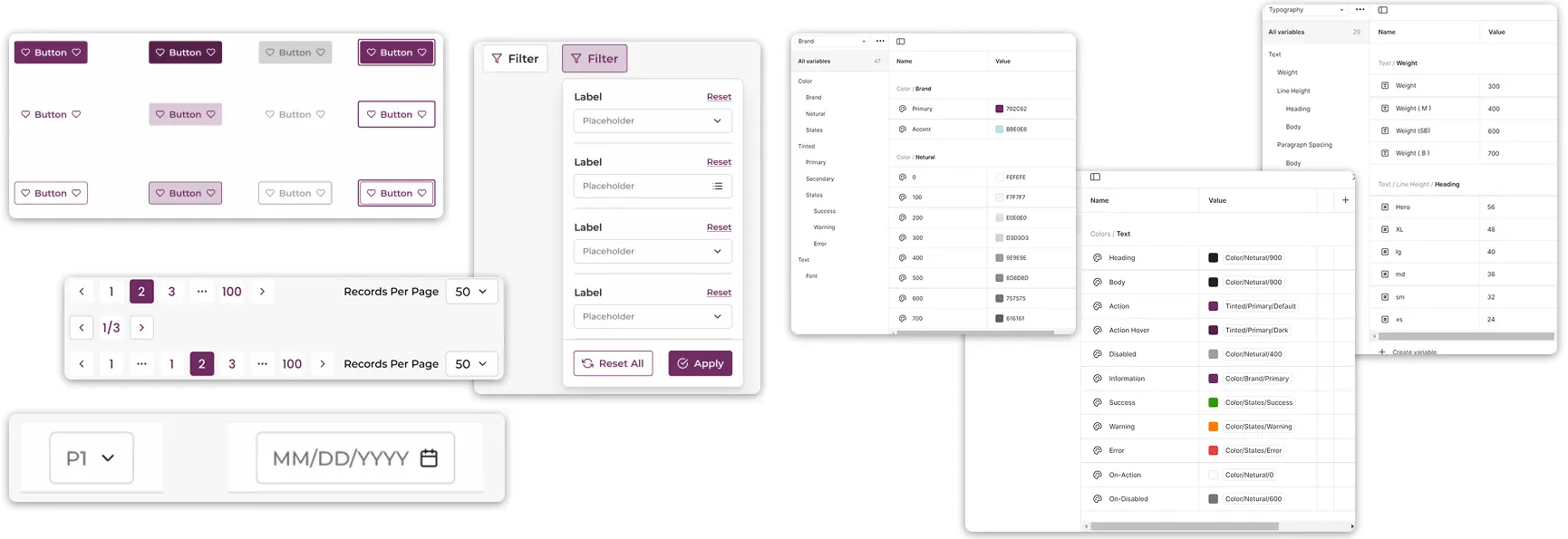
Token-driven theming with WCAG 2.1 AA baked into every component.
04 · Key screens
The flows that carry the product.
The dashboard: glance, then act
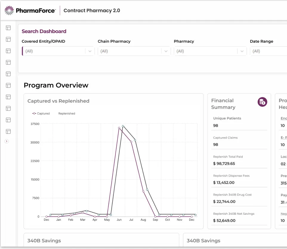
Financial summary, program health, and claims activity surfaced as widgets. The drill-down became a glance.
The configuration wizard: three answerable questions
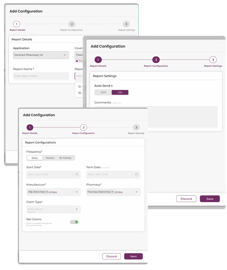
“Add Configuration” wizard
- Report details
- Configuration
- Settings
Bulk upload: validation before cost
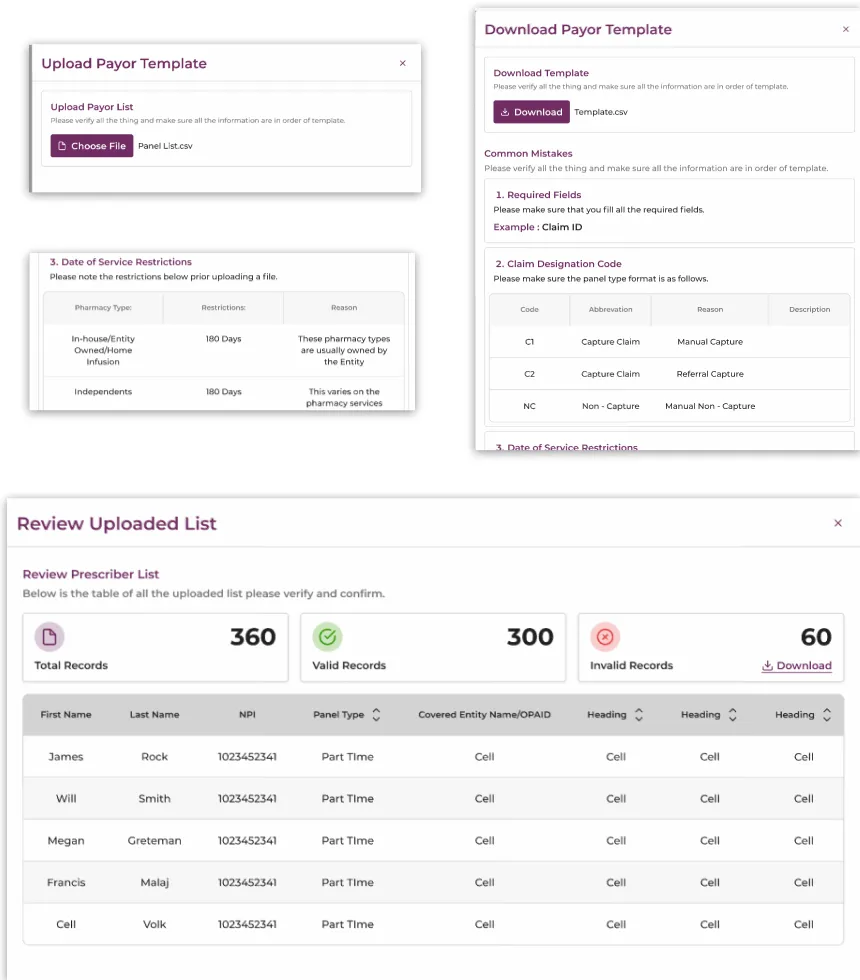
Bulk Payor Upload wizard
- Template pre-formatted CSV
- Upload validated on entry
- Review submit the valid set
05 · Craft at scale
One library, seven products.
The proof of a UI system is the screen you did not design. It should still look like you did.