Flagship case study · Defense · Ground Control
Inventing a control language for machines that fly.
A ground control station for autonomous drone swarms in defense operations, where operators, analysts, and commanders share one screen and every click can affect lives.
01 · Context & business problem
Mission logic lived in code. Operators lived in fear of it.
We weren't redesigning. We were inventing a control language for machines that fly at 144 km/h, make real-time decisions, and operate in groups.
- Prechecks were scripts. Mission-critical logic lived in code, with no interface for non-developers.
- Missed steps meant aborts. A skipped logic step meant flight failures and wasted missions.
- No swarm planning existed. Multi-drone synchronous missions could not be designed at all.
02 · My role & constraints
UX from zero, under field conditions.
I owned the UX end to end: research with tactical drone pilots, mission analysts, and defense engineers; the information architecture; and the three core flows. One operator set the bar: “Too many buttons. I'd hesitate instead of launch.”
- Glove-friendly, daylight-usable, meaning field conditions, not desk conditions.
- Works without training, because hesitation is a failure state.
- Calm under stress, with sparse layouts, dedicated alert zones, reversible actions.
03 · Architecture
A layered command architecture before any screen.
Operator insights became design law: action always visible, destructive commands get timed confirmations, every flow interruptible and reversible.
Every task flow had to be
- Intuitive no training required
- Sequential one step at a time
- Interruptible pause without penalty
- Reversible every action can be undone
The UX Command Stack: five layers, one home for every element
- Action Layer
Instant commands and triggers.
Launch / Abort / Payload buttons - Mission Manager
Plan, assign, and configure drone behavior.
Mission flow, waypoint setup - Swarm Status Layer
Always-on awareness of each drone’s health and role.
Drone cards, telemetry bars - Visual Map Layer
Spatial awareness, drone trails, and danger zones.
Live map with overlays + icons - Feedback & Alerts
Communicates critical events, states, and errors.
Error modals, state chips, confirmations
04 · Validation
Validated with the people who fly them.
Round 1: 6 drone engineers, 2 QA analysts. Round 2: live operations with 4 new operators and 3 mission commanders.
05 · Results
The outcomes, as measured.
06 · What I would do differently
Simulate stress earlier.
The biggest lesson, designing for stress rather than just use, arrived through testing. Building even a crude swarm simulator first would have surfaced the hesitation moments before any operator felt them. The best interfaces are the ones you forget about mid-flight.
01 · The essence
Futuristic: a cockpit from five years ahead.
This UI is science fiction with a safety case: HUD panels with cut corners, thin cyan structure glowing on near-black, telemetry set in mono. Nothing shines for style. Every glow is a state an operator must trust at 144 km/h, in daylight, through gloves.
02 · Foundations
A grammar for the dark.
The palette
Values sampled from the shipped dark UI. Every hue on this palette is a state an operator must trust.
#0E1114 app background #171C21 HUD surfaces #46D7E8 tabs · borders · flow #35D07A ready to fly #F2B33D in mission · swapping #E4574D troubleshoot · RTL #A6A8F0 solution tags #9FB3BD telemetry text The type scale
A compact sans for structure; mono-feel chips for telemetry, because a battery percentage must be read in a saccade.
The spacing rhythm
4 8 12 16 24 32 The corners
Panels · 4 Chips · 999 Corner cuts · 0 The product's own components
03 · The surface
Five modes, one language.
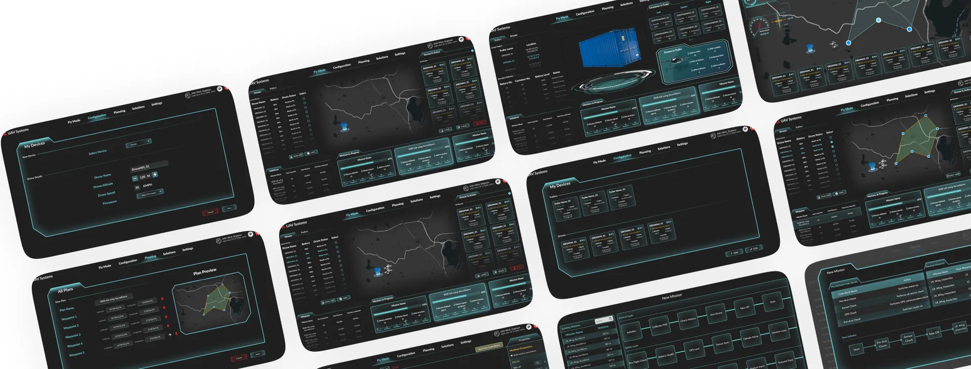
Persistent global navigation and a sticky action bar mean the two things an operator needs most, where am I and what can I do, are never more than a glance away.
04 · Key screens
Three core flows, one language.
Drone Status Panel: see everything, instantly
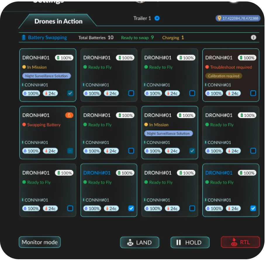
Modular status cards for 10+ drones at once, with a sticky LAND / HOLD / RTL action bar.
Mission Logic Builder: prechecks without code
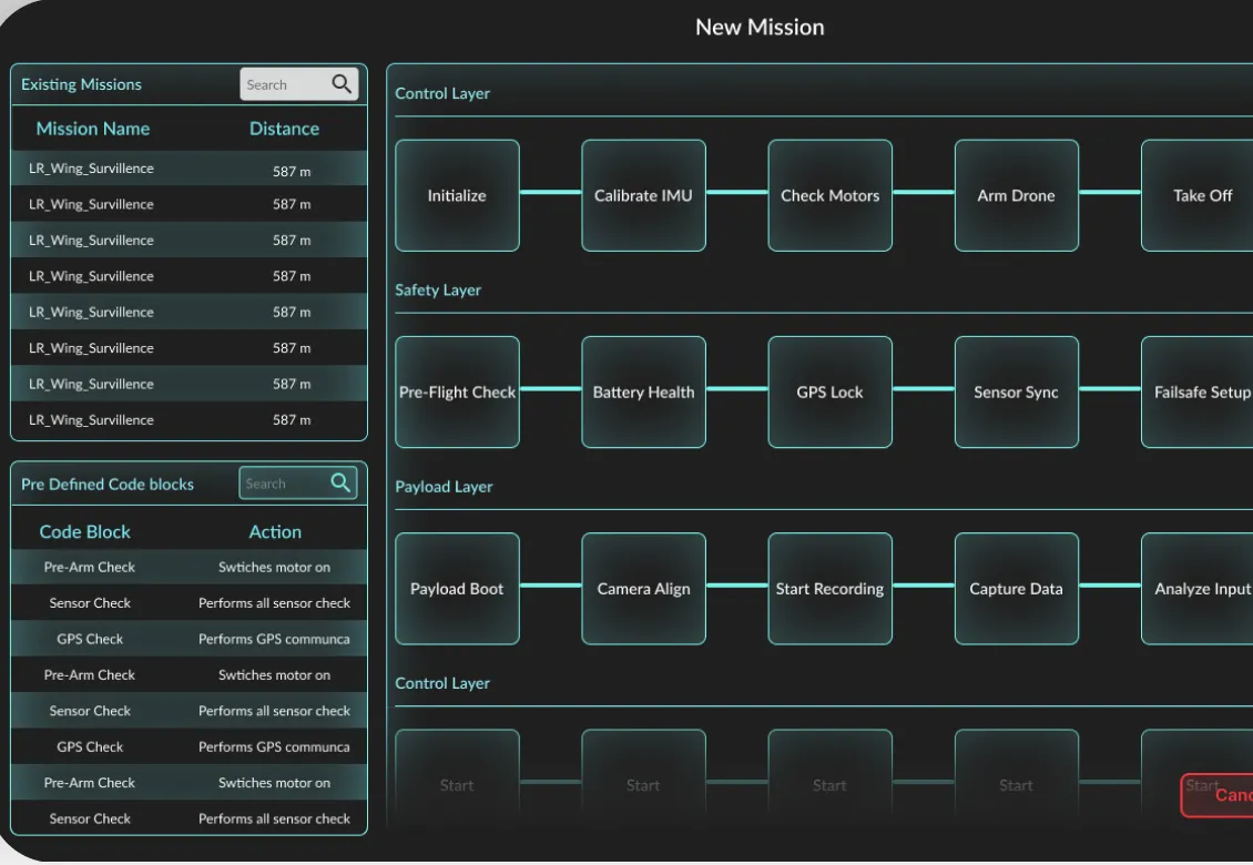
Scripted prechecks became a visual node graph, with predefined blocks chained across control, safety, and payload lanes.
Swarm Planning: choreograph the group
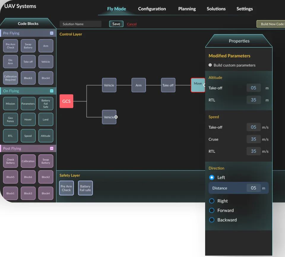
Sequential drone logic
- GCS
- Vehicle
- Arm
- Take off
- Move
05 · Craft & compliance
Checked like flight hardware.
A mission-critical UI earns trust in the details nobody sees.